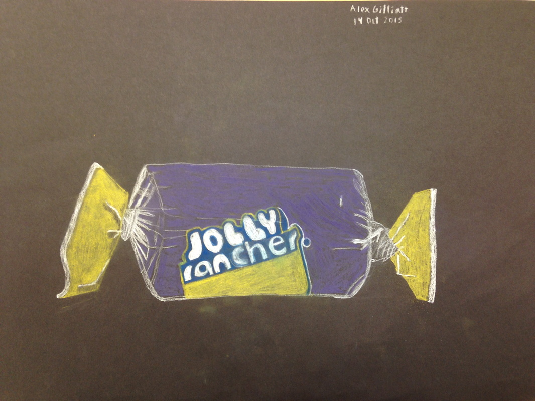
 This is the second real project with which I have used pastels. Hoping to find something I'm more comfortable with, I stuck to the pencil form, as without it I wouldn't have a hope of writing the brand name properly. Colors were chosen out of necessity rather than what best reflected the piece due to the effort required to hunt down specific colors, but I think it looked alright overall. The twist on the right could use some touching up, but I'm happy with it.
0 Comments
Leave a Reply. |
AuthorWrite something about yourself. No need to be fancy, just an overview. Archives
January 2016
Categories |
 RSS Feed
