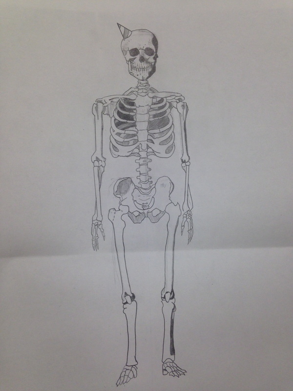
 The skeleton project was a return to form for me. The insistence on detailing ultimately required that I finish at home but it was by no means an excruciating exercise. One may notice the level of detail slowly lowers as you look lower but it retains realistic proportion throughout. Joints gave me a bit of trouble as well as making everything symmetrical. But having finished it I found it useful and fun.
0 Comments
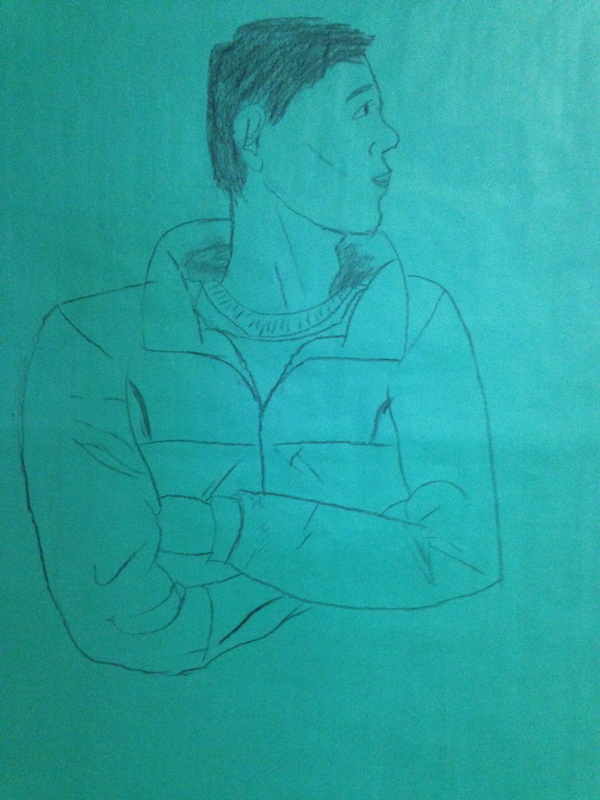 I developed my art making skills with the use of charcoal. In addition to improving my skills with charcoal it's bettered my knowledge of how the human body curves to form itself. This also allowed me to become a little less rigid with my artwork. Until this class I almost exclusively drew in a style that kept me hunched, constantly drawing and redrawing in order to get a perfectly detailed image. Being forced to use a medium that isn't accepting of this tactic has allowed me to expand my horizons in general, across all mediums. We collaborated with decision making as well as modeling. Poses were chosen after a short conversation based on what would be the best mix of interesting to draw, interesting to observe, and easiest to model. We also advised each other on small choices such as perspective and what to spend more and less time on. I reflect on my use of time. I feel as if I did an acceptable job on the face and neck considering my lack of experience in the medium and did well on the jacket. However spacing severely damaged the piece. The legs are both rushed and squat, compared to the model's actual proportions. In addition the shoes are little more than filling a requirement. As time wore on and my model wore impatient I quickly added them to give the effect of a full body, rather than extend the legs and cut it off at the ankles. 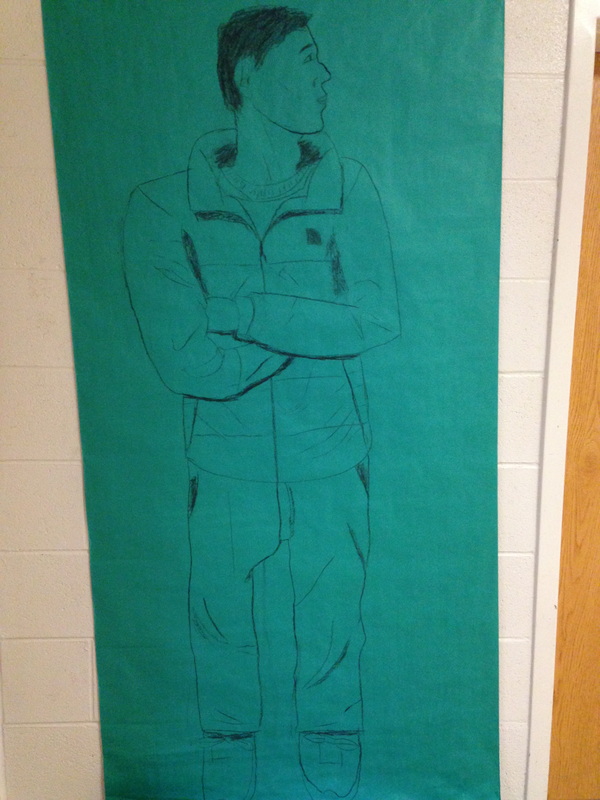 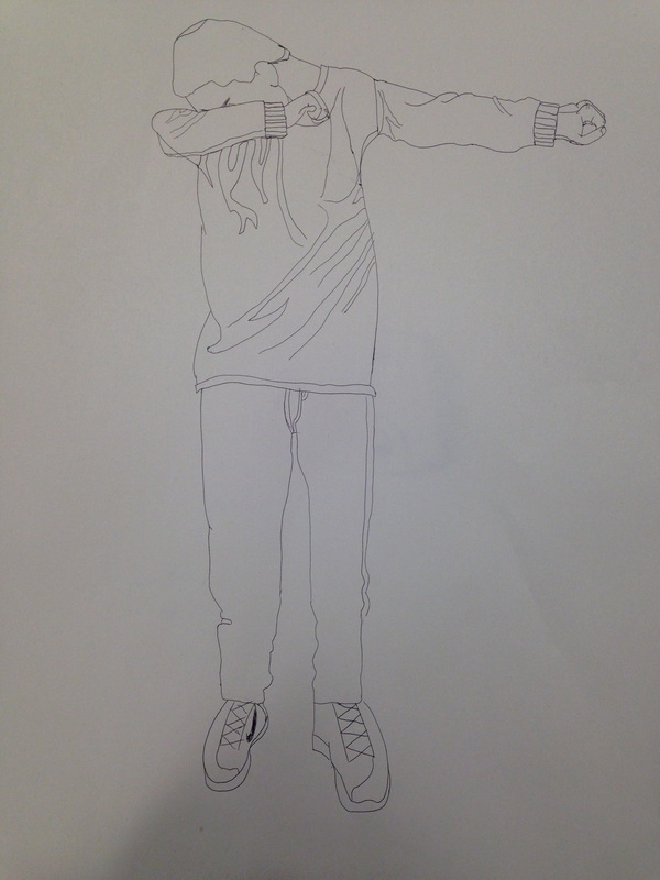 I'll admit that I lost some of my comfort with pen since we began with it early in the semester. Above is my best, and below my worst. My best would've been a great deal better had I two affordances. More time, as virtually the entire thing was rushed by my bemoaning model, and Noah holding still. He chose the pose, mind you, but constantly fidgeted, changed posture, and several times completely changing pose, leaving me to guess at details. The worst is predictable, as it's the one done blindly. It turned out better than expected though, having the head proportions vaguely in the right positions. 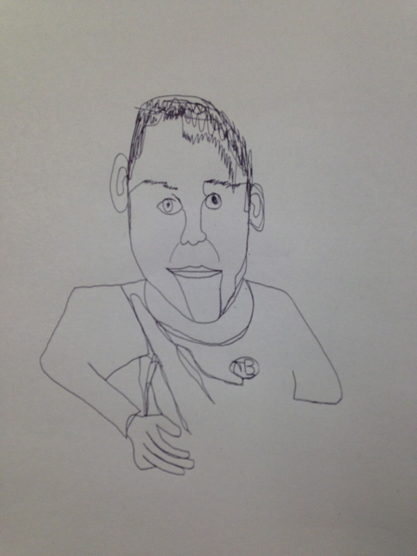 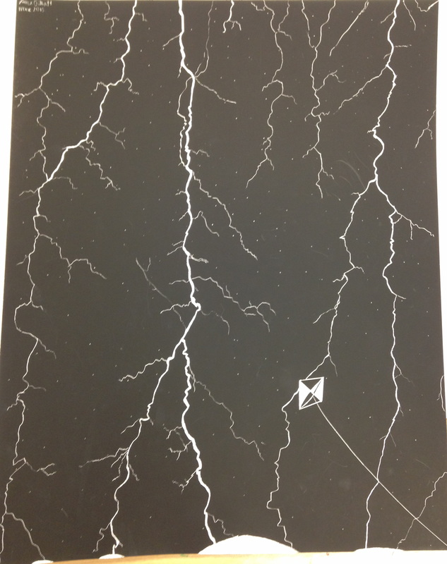 I developed my art skills by using the blades available to me. Before this class I'd been comfortable only with the various types of pencil. Moving on to charcoal and pen was simple enough but working in negative, lacking a way to undo mistakes, and the feeling of using a scraping agent instead of a dragging agent is a completely different experience.
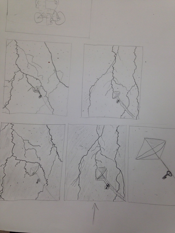
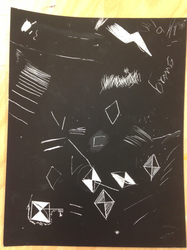
I solve problems with my paper. I don't believe it was my own doing but I'll never know: from the beginning the scratchboard has several smudges and scrapes on it. When it was blank is was most obvious to be seen, but I managed to distract from the imperfections first with the bolts, then with the stars behind it. If one were to look closely, they could see the smudges, though if one didn't know what to look for, it wouldn't be noticed, and thus not subtract from the work. I reflected on my piece from the outset. I never doubted that I would succeed in what I intended to do. Small errors aren't separable from the seemingly random scrawl of actual lightning. However I found that it lacked substance like I had hoped. What I believe would add interest would be a background or something to show scale at the bottom. Instead of the light bulges (which I researched and would actually be there, by the way) at the bottom, I thought of placing woodlands, or perhaps a village. The latter would require I shrink or remove the kite of course, but it would lend credence to the size and strength of the billion joules of energy crashing down from above. 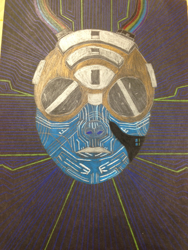 I communicate through my art as it applies to both personal interests and important future quandaries. The idea of transhumance augmentation, or supplementing your body with machinery in order to improve function or prevent illness is a sticking point for me. On the surface it sounds great; stronger, faster, smarter, and more efficient humans are better humans. However a divide will be forged as the richer humans can afford to be better at everything, while the poor have to rely on their increasingly unemployable skin and bone as the workforce demands steel and carbon fiber. I made this in an attempt to create something in between. It's not entirely machine but far beyond the realm of the human. It's a world we may see relatively soon.
We collaborate with decisions relating to the outcome of the piece. The color for the face was chosen by my partner as I couldn't choose between two. The silver for the face was recommended, so I decided to use both the original white and the silver. The secondary color of the helmet (brass) was chosen by you, and so was the rim around each of the eyepieces. I have a global awareness of artmaking. Art is not necessarily pain or pen, and as such I gained inspiration mainly from two video games and a series of books. System Shock 2's SHODAN, a mad AI living as a god in cyberspace lent the blue and white aesthetic while Deus Ex supplied the thoughts of transhumance augmentation and having a figure in the center of it. The other pieces used for reference were made by independent artists, though they all were inspired by William Gibson's book, 'Burning Chrome', a cyberpunk work of fiction that inspires virtually everything made in the genre. 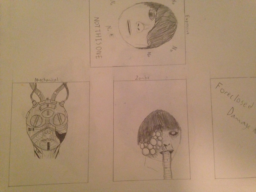 These are the thumbnails for the expressive, zombie, and robotic portrait assignment. The zombie was inspired by the smoker from L4D2, with a host of smoker references to suit it. The one I ended up doing the project on was the mechanical one. It's intended as a sort of cyberpunk rendition of cyberspace. The references came from Shadowrun, System Shock, and a series of one-off pieces from anonymous artists.
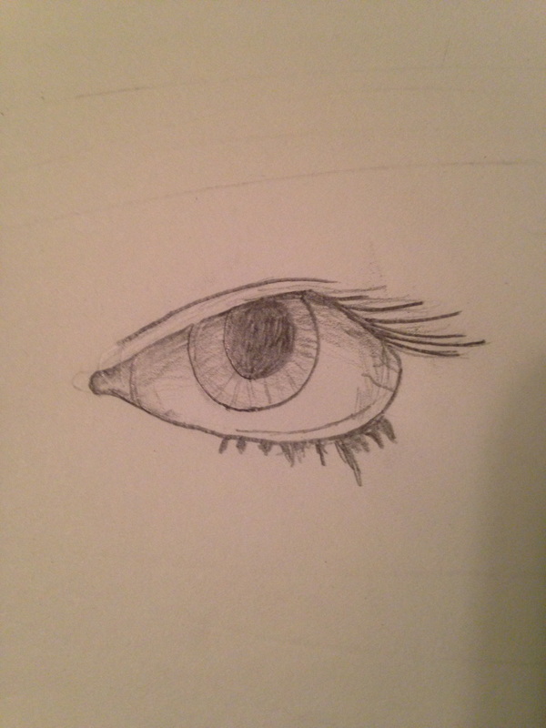 I did the eye, nose, and the face of my partner with a regular #2 pencil. I think each turned out rather well, which I should expect considering the amount of time that went into each. I'm satisfied particularly with the nose. I never stopped to think about it much but it points up more than out and it's crooked on my face. Something I'll never stop noticing, thanks Ms. Rossi. 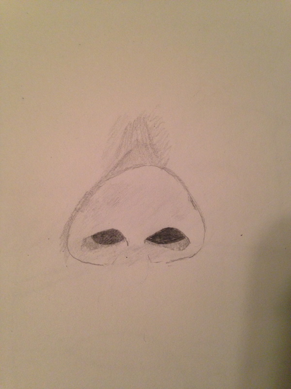 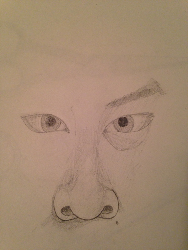 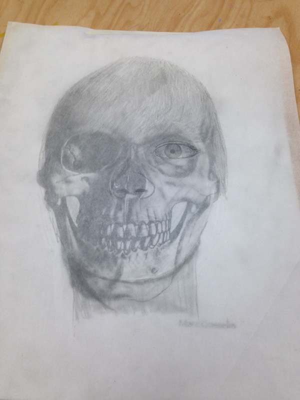 This project was one I fretted over incessantly. The nose and eye went well enough but my style is one of constant revisions, something not suited to trace paper. The matter of the skull compounded this, as my head isn't this almond shape, and I had great difficulty with the lips and jaw as my skull is wider and shorter than the one provided, and thus made an unrepresentative image. Asked to critique, I would prefer the exercise be a short affair, best for getting one's bearings on the typical bodily proportions, rather than the multi-day project it turned into. 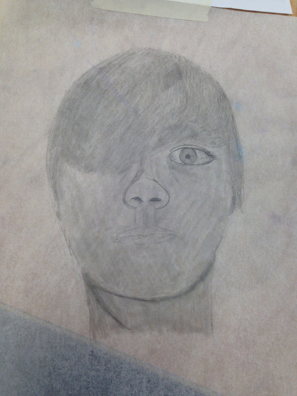 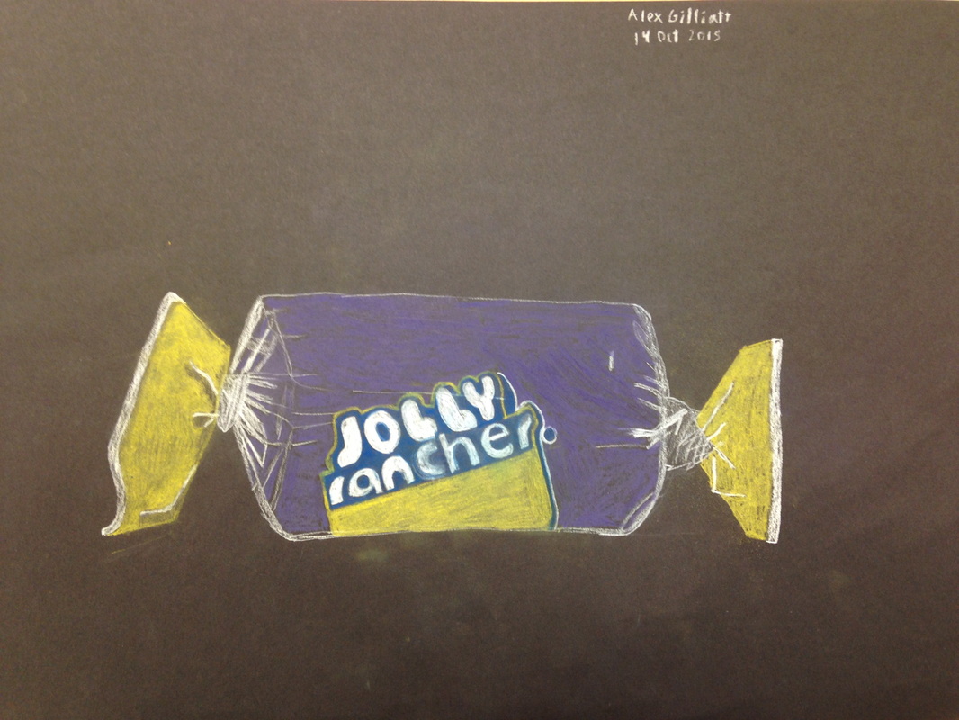 This is the second real project with which I have used pastels. Hoping to find something I'm more comfortable with, I stuck to the pencil form, as without it I wouldn't have a hope of writing the brand name properly. Colors were chosen out of necessity rather than what best reflected the piece due to the effort required to hunt down specific colors, but I think it looked alright overall. The twist on the right could use some touching up, but I'm happy with it.
|
AuthorWrite something about yourself. No need to be fancy, just an overview. Archives
January 2016
Categories |
 RSS Feed
